
grey or gray
you pick. interestingly, the old english word for grey/gray is grǣg. so, that’s why ‘a’ or ‘e’ is fine.
jodi and i were walking down the street the other day. cummins is littered with apartment buildings. one of them was recently repainted grey. it was previously a two-tone brown/beige color. the latter apparently a zoning regulation for apartments here. not sure how this particular complex received a variance.
she uttered something akin to this statement, “i hate grey. i’m sick and tired of seeing grey everywhere.”
“my website is grey,” i commented.
“no it’s not,” she said.
“most certainly is. when was the last time you visited it?”
spooky happenings
here i sat this evening, and youtube magically showed this video on my home page. i don’t believe in coincidences and they seem to be happening a lot. we won’t discuss that today. suffice it to say, something very complex, or possibly not, is going on. i have no idea what it is.
this is a video about the intersection of color in human perception and utilizing an understanding of how the brain perceives color to make art. pretty interesting actually. not high brow science or psychological at all. just practical. this guy worked for pixar. that’s interesting by itself.
life would be boring with no grey
the day after the “i hate grey” discussion, i was thinking about grey. grey is an intersection. the middle ground. a mix. a muddled mess sometimes. others a beautiful arrangement. often, neither of those – something in between. or all of the between. if it’s not white or black, it’s grey. in an infinite sea of white/black and black/white mixtures, there are only two pure values: pure white and pure black. everything else is grey.
that’s a whole lot of everything else. we all literally live in the grey.
with some color thrown in for good measure.
my thoughts went down a major rabbit hole, which would be too lengthy and boring or deranged for here i think. i was pondering grey and life this morning and the fact that this video appeared this evening prompted me to write something. well, because grey color is relative apparently.
jodi said she didn’t think my website was grey. it was sort of a shade of blue.
i think he should have titled his video ‘the hidden secret of grey: color relativity”
the rgb value of my website background is 40, 42, 45. it does lean a little toward blue.
a note at the end
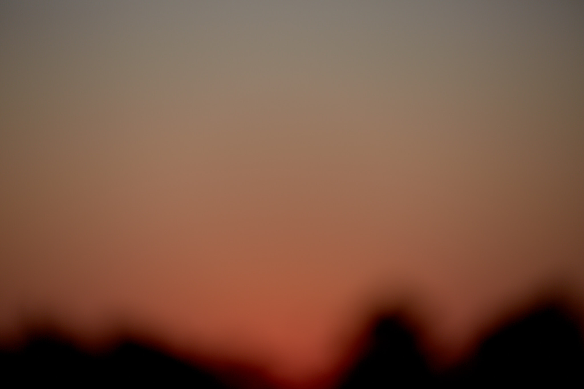
that blurry image at the beginning of this post is from an experimental photo series of a sunset. i intentionally blew the focus out. the dark shapes are trees. only a slight adjustment to the rgb level of the image to boost the brightness a bit. i never posted any of these anywhere as i was just playing around. seemed like a nice fit here.
❤️